Adding charts
You can add and customize pie charts in your Gliffy drawings. This video shows a quick view of the formatting options. See below for more detailed instructions.
1. At the bottom of the shape libraries, click More Shapes. The More Shapes window opens (see View more shape libraries).
2. Select the check box for the Charts library and click Okay.

3. From the library side bar, drag and drop the chart shape you want to use to the canvas.
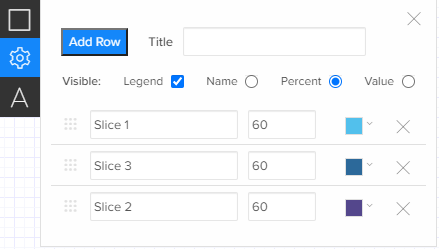
4. Click the gear icon ![]() to edit the custom properties of the chart. You can add a title, show or hide the legend, and change the display of the name, percent, or value of each chart row. Enter the title and value and select a color for each chart row. You can drag and drop the selection icon
to edit the custom properties of the chart. You can add a title, show or hide the legend, and change the display of the name, percent, or value of each chart row. Enter the title and value and select a color for each chart row. You can drag and drop the selection icon ![]() to reorder the chart rows.
to reorder the chart rows.
5. Click shape properties ![]() to change other properties like border color and border thickness (see Format shapes).
to change other properties like border color and border thickness (see Format shapes).
6. Click text properties to change the fonts, colors, styles, and alignment (see Format text).